
It messes things up. (only if you can't afford a 4k display...)
Intro.
Ok.. lets begin. I have used CLion for a while now. I really don't liked how the font was rendered. It was big fat and ugly. On my Mac Book it looks really really good. Most likely because of the retina screen.
I don't have a retina screen here. I have this relatively old Samsung 16:10 Monitor. It has only 1920x1200 pixels so no 4k here.
The font looks like us humans, after eating to much over christmas.
If you don't have a retina display or 4k you can fiddle with your font settings for hours! I mean you're staring at your screen for hours, in my opintion its really important to find a good font and that the rendering of that font is "pixel perfect".
To find a good font go here: https://www.programmingfonts.org/
But first lets turn of that Font Smoothing in Mac OS X.
Turn it on/off
Go to: System Preferences --> General --> Use font smoothing when available turn this off. You will see a difference.
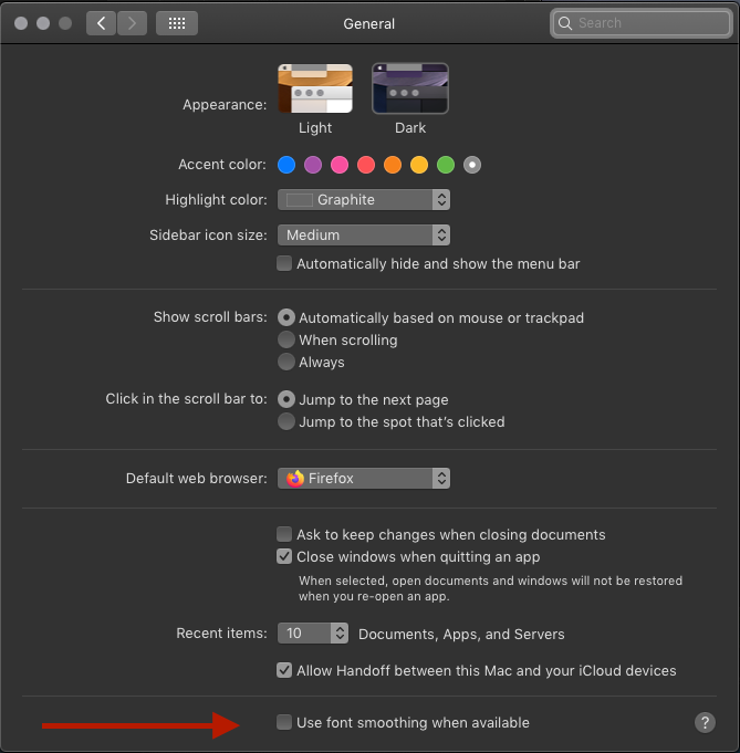
What does apple say about this feature?
Font smoothing reduces jagged edges for some fonts. When text smoothing (or “antialiasing”) is on, smaller fonts may be harder to read.
Yes not only smaller fonts but source code in general will be harder to read. The font looks like us humans, after eating to much over christmas.
The Problem I think what is happening is, that CLion has it's own anti-aliasing. Mixed with the anti-aliasing from OS X and CLion messes things up. The funny thing I experienced is, that in PyCharm for example that problem does not exist.
This topic is so big and not trivial if you want to dive in start with these wikipedia articles:
- https://en.wikipedia.org/wiki/Font_rasterization
- https://en.wikipedia.org/wiki/Aliasing
- https://en.wikipedia.org/wiki/Subpixel_rendering
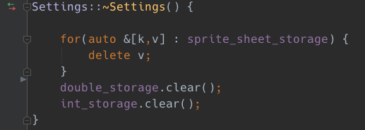
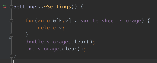
It's hard to tell from the images but I can guarantee you it looks better on screen as on this screenshot.
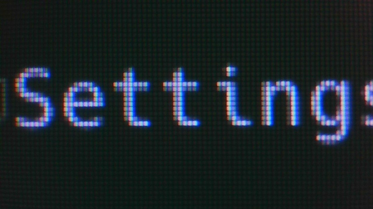

As you can see on the captures above, you can clearly see that the letters with Font-Smoothing on are way to thick.
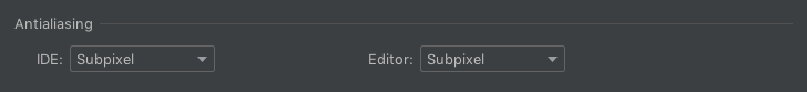
I'm using CLion 2020.1 with these Font Settings:
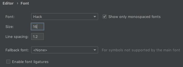
I'm using this font: https://sourcefoundry.org/hack/
If you press this Button it will Load Disqus-Comments. More on Disqus Privacy: Link